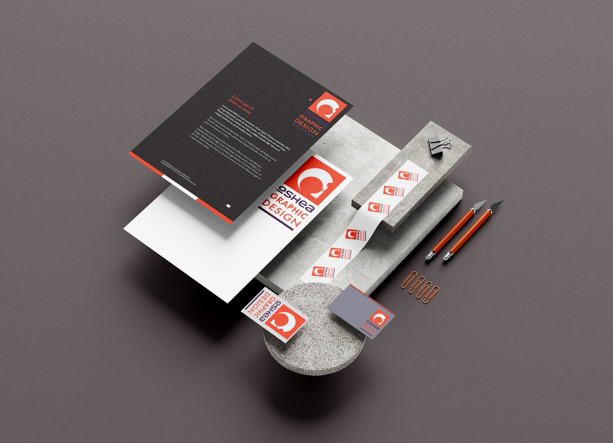
Some of the typical thought processing and Psychology behind all of our design:
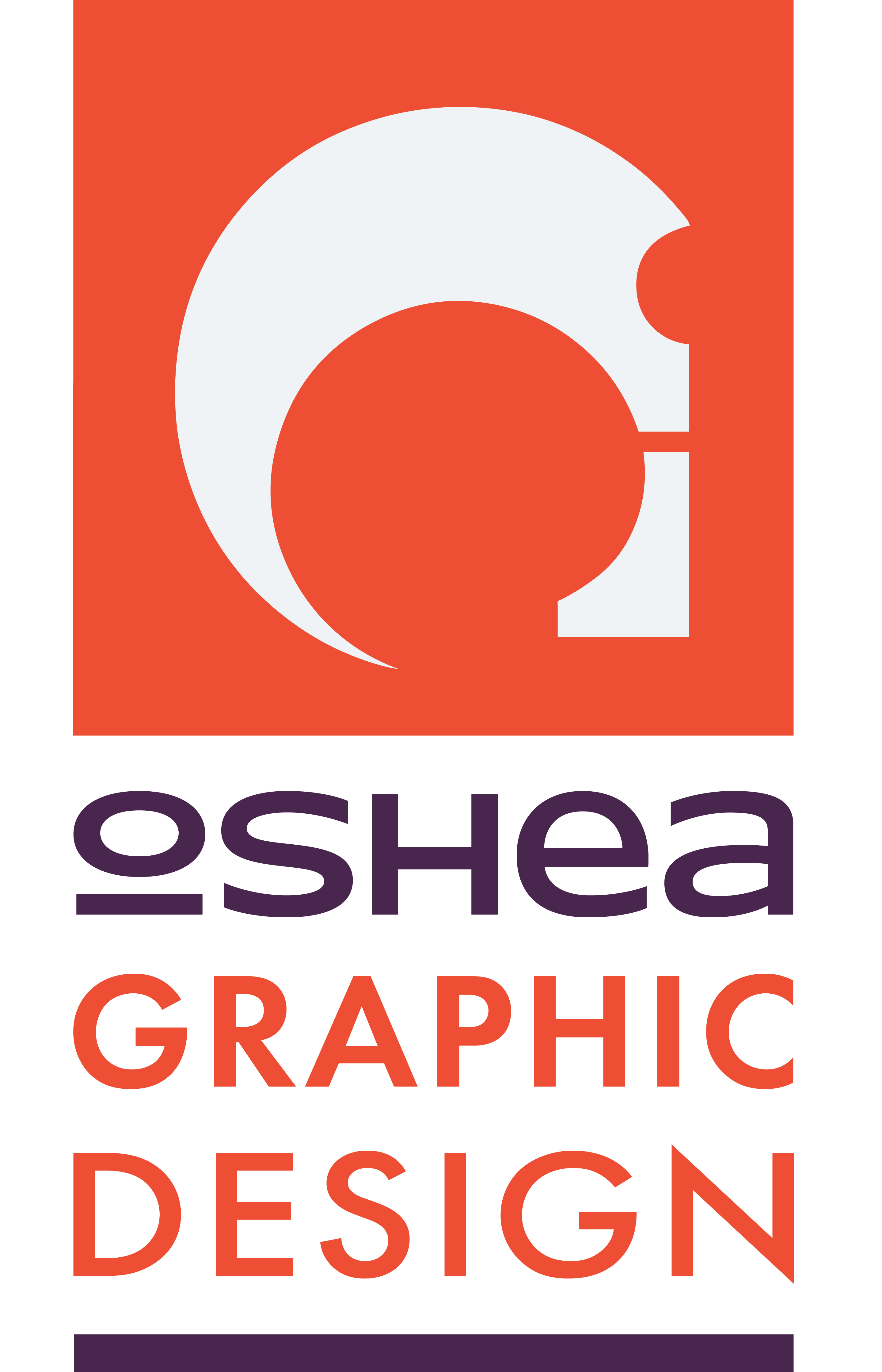
oshea graphic design started life in the photography world and our logo was born there, it has evolved and been refined ever so subtlely since.
We wanted something to very much look clean, classically designed and engineered and also something that mirrors our thoughts and vision.
We originally worked on naming ourselves OI design (Oshea Idea)and with these letters and a sort of camera icon this is where we arrived to.
It is fairly complex in mathematical nature yet quite simple in look which very much represents our minimal ethos.
We have a penchant for the abstract and admire the sculptural works of Barbara Hepworth and Henry Moore among others. The forms and shapes they created are aesthetically pleasing elements we are delighted to explore in our own work. The lines of the shape within the orange square have been sculpted to create several other shapes or abstract representations.
For visual balance, order, and dynamics our colour scheme was based on analogous colours.
Orange is a very vibrant and energetic colour that can represent change and movement. Orange is also strongly associated with creativity and often with health and vitality. In designs, orange commands attention without being as overpowering as red. It’s often considered more friendly and inviting.
Purple is very much associated with creativity and imagination also. In history purple was a very expensive colour to create so only royals and the very wealthy could afford purple! In design, dark purples can give a sense of wealth and luxury.
Grey is a very modern colour. With correct use it is both formal and sophisticated, it often features in corporate designs, where formality and professionalism are key.
Typography is one of the most powerful tools in visual communication.
Keeping with the contemporary trend of mixing fonts and weights we used FUTURA, a sans serif face based on geometrical shapes representative of the aesthetics of the Bauhaus school coupled with the Charles R. Mackintosh inspired HOTHOUSE which was designed in 2001 for The Glasgow School of Art and is still used by the university.

